Sunday, December 28, 2008

Bobby Flynn (1991)

When I was visiting my folks over Christmas, I took a morning to rummage through some of my old artwork which was stowed away in my bedroom closet. More precisely, my parents asked me to clean out my closet (when was the last time you heard THAT?). I was lucky enough to find this, my first "official" sketchbook, from 1991—making me 11 years old at the time. I know this because I dated practically every page of the book—signature included. As you can see here, I very clearly stated the rules of the sketchbook on the inside cover:


1. NO TRACING!!
2. Sketch lightly the(n) press down hard.
3. No ripping pages out!

Simple rules to live by, I suppose. Oh, also good to note that I was known as "Bobby" until I was a senior in high school.


Here is a page dated 1-1-91, New Year's Day! Making the sketch 18 years old to the dot in just a couple days. Entitled, DYING ROBOT. Wow, I was fascinated with characters in desperation even then!


Here is a character I must've been working on named Turtle Tort.


...including a cast of other characters. I don't remember doing anything with them, though. I believe this was when Tiny Toon Adventures was on TV.


Finally, a drawing in colored pencils of Dimension-X...with Leonardo and the Technodrome in silhouette. I'll be doing another post entirely about my obsession with the Ninja Turtles, soon. This sketchbook is loaded with them.

Fast forward to the end of 2008, with 2009 knocking on our door. It's been a great year...thanks to everyone who's been stopping by the blog. Happy New Year!

Saturday, December 20, 2008

We'll show YOU naughty...


(click on image to view larger)

Ahhh...the holidays bring out the best in us, don't they?
Funny, I tormented Santa last year too.

Tuesday, December 16, 2008

Sweet Nectar


Hopefully my last post didn't throw you too much.
Back to creatures and cartoons!

Saturday, December 13, 2008

Favorite Music of 2008


2008 was an interesting year for me, musically speaking. I found myself at the beginning of the year catching up with albums I missed out on from previous years. The likes of which included Justice's Cross, LCD Soundsystem's Sound of Silver, and Jim Noir's Tower of Love. It was also a year where I spent more time scrounging around mp3 blogs, resulting in my iPod filling up with singles and tracks instead of albums. So, I found myself in the past couple of weeks struggling to come up with a solid Top 10 list of albums—specifically having difficulty filling the #10 slot. The two major disappointments of the year for me have been Of Montreal's Skeletal Lamping and Kanye West's 808's and Heartbreaks. The later is growing on me a bit as of late, but I still don't think it deserves a spot in an official Top 10. Even stranger, Los Campesinos!, which you will soon find is easily my favorite act of the year, released a second album only months ago, We Are Beautiful, We are Doomed...which I find nearly as impressive as their debut album. I don't know the official rules of Top 10 lists (venturing into obnoxious territory here), but I'm pretty sure it would be weird to put two albums by the same artist in one list.

ANYWAY, all that rambling is just a big excuse for what I'm calling a Top 9 list of albums. To fill in the gap of the missing #10 slot, I've decided to drop a bunch of songs on you as well. I'm not doing a write-up this year on each album, but consider it safe that I heartily recommend all this music for anyone who is looking for a change of pace.

TOP 9 Album Picks:

1. Los Campesinos!: Hold On Now, Youngster
2. Marnie Stern: This Is It...
3. Vampire Weekend: Vampire Weekend
4. Born Ruffians: Red, Yellow, and Blue
5. The Dodos: Visiter
6. High Places: 03/07 - 09/07
7. Fleet Foxes: Fleet Foxes
8. TV on the Radio: Dear Science
9. Atlas Sound: Let the Blind Lead Those Who Can See But Cannot Feel

Top 5 Songs:

1. "Ruler" - Marnie Stern
2. "White Winter Hymnal" - Fleet Foxes
3. "Fools" - The Dodos
4. "Paranoid" - Kanye West
5. "Water Curses" - Animal Collective

and a smattering of other great tracks and singles from the year:

"Single Ladies" - Beyoncé
"No One Does It Like You" - In Ear Park
"Toe Jam (Featuring David Byrne and Dizzee Rascal)" - The BPA
"Knickerbocker" - Fujiya & Miyagi
"Walking On A Dream" - Empire of the Sun
"Cranes And Cranes And Cranes and Cranes" - Johnny Foreigner
"In the New Year" - The Walkmen
"Little Bit" - Lykke Li
"5 Years Time" - Noah and The Whale
"Jitterkadie" - Death Vessel
"Arrows of Eros" - Golden Silvers
"RR vs D" - Au
"Why Do You Let Me Stay Here?" - She & Him
"Bruises" - Chairlift
"With Handclaps" - Y'all is Fantasy Island
"Machine In The Ghost" - The Faint

Feel free to leave comments (ideally, with your own best of lists!)

UPDATE:

(Favorite Albums of 2007)
(Favorite Albums of 2006)

Tuesday, December 09, 2008

Striking Gold


On the topic of difficulties drawing the opposite sex, it occurred to me that I enjoy drawing bratty girls. But I'm not sure that counts. I don't have a sister, but it must've rubbed off on me from all the cartoons and movies I've digested over the years that older sisters are mean and younger sisters are mischievous and annoying. Which to me equals FUNNY. My favorite girl character I've come up with so far (by far) is Goldisocks. I think she is more nuanced than the typical bratty stereotype—she's downright charming and adorable if you ask me! I caught her in a bad mood today, maybe because of the holidays.

She was just as much fun to draw again now, and she wouldn't have been made possible without the help of Sharon Emerson and an ever so beautiful voice.

I've posted before about Goldi here, but for those of you who missed out, take this short science game/fable for a spin. I hope a bunch of kids learned about the difference between heat and temperature by watching this :)


--> Play Goldisocks

Makes me want some porridge!

UPDATE:

I just dug up a scan of my original concept sketch. Somehow the paper copy got lost. Glad to see the uni-brow was in there from the start.

Saturday, December 06, 2008

A Predicament

Tuesday, December 02, 2008

A little something new...


I prefer to think of style as something that is constantly evolving and not a conscious effort. You fall into habits and typically draw what you know. Lately, I've been thinking about what I'm not good at drawing—for new territory to explore. I've never been particularly happy with my ability to draw girls or women. But I've always admired all these cartoonists and animators that can whip out fun girl characters (both past and contemporary), so I'm studying. Here's an early design, definitely inspired by what I've been looking at...hopefully with a twist of something that is my own. Weird, because I started out saying that style shouldn't be conscious, but sometimes you need to dive in and see where it takes you. That's how you grow as an artist, anyway.

Sunday, November 30, 2008

New Comic for ARGH! #5

As promised, my 4-page comic:


The orange-red you see here printed as a truer orange in the magazine.

For all the information you'd ever want about ARGH!, go to ArghComic.com...all issues (including this one) are available for purchase.

For more info on issue #5, look at this earlier post.

For some process work on this comic: (1) and (2)

Also, feel free to hop on over to my comics site at Jinx the Monkey to view all the comics from past issues of ARGH! and an assortment of single page comics.

Friday, November 21, 2008

SpongeBob: Say Cheese!


You're gonna have to excuse some of the drama apparent in this post. I just went to CVS to pick up a prescription for my wife, and sneaked over to the magazine section to see if the December issue of NickMag was out yet. I saw a cover with Spongebob wrapped in a bow, drawn by the super talented Sherm Cohen. The issue is wrapped in plastic because it comes with a free poster, so I had to wait until I paid for everything until I could open it. And there it was...my first SpongeBob comic, Say Cheese!


I don't have the final version with the speech balloons and logo, but this is the color file the fine people a NickMag sent me back in August:


I wrote, penciled, and inked the comic, after initially pitching the idea to the editors. Wes Dzioba handled the coloring and did a fabulous job! It was so fun to send out my inked version and have it come back SpongeBob-ified with all the right textures, colors, and flowery patterns in the sky. This is indeed a huge first for me. And surreal! I'm working on pencils for another SpongeBob comic now, featuring Plankton and the bunch.

If you see it at a newsstand near you, snatch up a copy. There are all sorts of great comics in this issue. If you haven't already, hop on over to the Nicktoons Comics site where you can view a huge collection of comics from past issues.

Sunday, November 16, 2008

Sunday Morning Warm-up


Getting ready to pencil some comics this morning...

Friday, November 07, 2008

ARGH! #5


This is a special message to all comics fans from Spain. Issue #5 of ARGH! is hot of the presses, and is now available at a comic book store near you. I posted a teaser page from my comic this summer, which you can view --> here. This issue is in orange and blue, and includes comics by Félix Diaz, Jorge Parras, Ferran Esteve, Molg H., Martin López, Nestor F., Brais Rodriguez, Paola Gaviria, Mar Malota, and Jorge Perez-Ruibal. I'm the one American in the bunch, but my comic is translated in Spanish. I'll be putting up all 4 pages eventually, but for now....go out and BUY IT...only 5 euros! The above cover art is by Jorge Parras.

For more info, go to ArghComic.com.

11/08/08:
ARGH!#5 is available for purchase online now (along with the previous issues)

UPDATE...

Here are some photos!


For related posts (and COMICS!), here's the tag: ARGH

Wednesday, November 05, 2008

Final Battle

Me and a bunch of folks at FableVision are wrapping up a 2-year project this week. We collaborated with MIT to create a Flash-based education video game to reinforce math and logic concepts. I posted awhile back (Customized Comics) about the comic that goes along with the game, revealing chapters of a larger story arch as you play.

I've been working with fellow artist Tami Wicinas on the final pages of the comic this week. We teamed up throughout, but the last comic has truly been a team effort as the deadline quickly approaches. Here is the pencil sketch I drew for the beginning of the final encounter with Echidna, the arch-villain of the game.


On to inking (all done in Flash with a tablet). I handled most of the character inking on this page; Tami filled in some of the backgrounds.


And here is the color treatment I'm going for—lots of RED, as you've just set off the alarms. The artists will run with this idea as they color.


Finally, I had a lot of fun melting down Echidna in this series of panels...she turns into a bunny. The comic is kind of in my style (less cartoony than usual). I fleshed out the look and feel with Keith Zulawnik, lead artist on the project, some 2 years ago. It's been awesome to work on.

Thursday, October 30, 2008

A Pumpkin Lineup


I had a bunch of friends over for my birthday last weekend and had a good ole-fashioned pumpkin-carving party. This lineup of characters is the result. A handful of them were by illustrators who blogs you may (and should) frequent, including Renee, Keith, and Allie.


Lights out!


These despicable characters are the ones my wife Loren and I created (mine on the left). I think Loren's is the more sinister of the two (I tried).


For pumpkins from previous years, click the halloween label.

HAPPY HALLOWEEN!

Saturday, October 25, 2008

A Robbery! (animated)


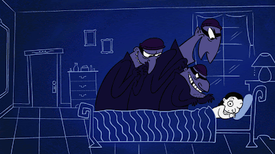
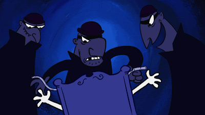
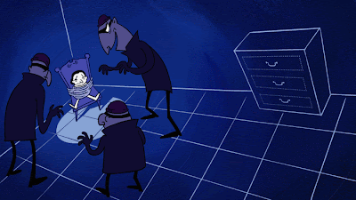
If you liked Helena Rubinstein in buying back her company, you'll be sure to get a kick out of her bossing around a bunch of burglars. Of all the stories I got to animate for The Powder & the Glory, this was definitely the best raw material to work from. The producers of the film encouraged me to play up the humor and the drama, but this really happened to her. It was an event destined to be animated!

The robbery ocurred in her later years, placing the animation style in the early 60s. At the time I'd been flipping through Amid Amidi's Cartoon Modern, and wanted to take stab at something more flat and stylized. I storyboarded this one very differently than the others, trying to use more dramatic angles. I also used Painter for the backgrounds, to add texture. Have a look at the animation below.


OR, you can watch it in full resolution, if you like.
(A bonus, because this one is better viewed large)

Again, I have to thank Dustin Wade for all his help. He handled the walk cycles and the animation for when the robbers tie her up. I should note that Rubinstein survived unharmed, though definitely shook up.

These are some of my favorite frames:


So that wraps up the week of animation at Drip! I hope you enjoyed them. We actually made 4 or 5 more animated segments for the film (I only posted my favorites), which you can see when it airs on PBS on Monday, March 23, 2009 at 10PM. I'll post a reminder when the date gets closer. And here's a link to documentary website.

Related posts:
History, animated.
Flappers and Lipstick
Helena Rubinstein

Thursday, October 23, 2008

Helena Rubinstein


This is the third in a series of posts I've been doing this week showcasing some animated shorts I created at FableVision for the documentary The Powder and The Glory. It appears in the film when they are discussing a moment in the midst of the Great Depression when Helena Rubinstein cleverly managed to buy back her company from Lehman Brothers (that's right, the now defunct Lehman Brothers)---and made a huge profit to boot! You might notice her height deficit. Rubinstein was only 4' 10", so I couldn't help but play up her Napoleonic stature.

I stepped out of black and white with this one, and decided on a washed out palette of greens, reds, and browns, to match that look of early 1930s Technicolor. It tends to read as a limited palette, but those of you who are familiar with the color Fleischer cartoons from the 30s will know what I'm talking about. The audio (as with all of these shorts) is rough cut, so the final version includes sound effects and whatnot.

Click PLAY to view the animation below. A note to those of you in RSS reader land to hop on over to my site to watch it here (the Flash embed doesn't show up in Google Reader for some reason).


Related posts:
History, animated.
Flappers and Lipstick
A Robbery! (animated)

Monday, October 20, 2008

Flappers and Lipstick


This animation, created for the documentary The Powder & The Glory, was a humorous take on how make-up suddenly became a public "ritual" and "performance" in the 1920s. It's definitely one of my favorites of the bunch. I did all the storyboarding and design to go along with the narration. I again called on Dustin Wade to help me animate some of the more difficult spots, including the flapper dance sequence. He figured out the mechanics of the movements in rough gestures, and I translated them into cartoony drawings.

You can view the animation below. Note, if you're looking at this in an RSS feed reader (like Google Reader), you're gonna have to hop on over my site, because it's a Flash embed.


I like to do a fair amount of redraw when I animate in Flash (as opposed to tweening). I reuse art assets when I can, but these shorts didn't require that as much. I was also trying to battle against the slickness of Flash to make them look authentic to the period.

Related posts: History, animated.
Helena Rubinstein
A Robbery! (animated)

Saturday, October 18, 2008

History, animated.


About a year and a half ago I posted (here) about a series of animated segments I was helping to create for a documentary film. I'm currently updating the animation section of my website and thought it would be fun to show some of them here before I finish building out the site.

The producers of The Powder & The Glory came to FableVision looking to use animated reenactments to illustrate moments in history. The film tells the story of two prominent women entrepreneurs who essentially founded the American beauty industry—Elizabeth Arden and Helena Rubinstein. Our job was to recreate moments in their lives that were never captured on film or photograph. Additionally, they thought it would be appropriate to match the animation style to make it contemporaneous. Meaning, an event that happened in 1930 should be animated in a style current to 1930.

Over the next week, I'll be showing a few of these shorts. The first, which you can view below, tells the story of how Elizabeth Arden decided on the name she used to launch her company. We took some visual liberties, but the story is accurate. The style is straight out of early 20s animation (my favorite period!). I did the character design, storyboarding and final artwork, and teamed up with the talented Dustin Wade on animation. The audio is a rough cut, and a little quiet, so you may need to turn up your speakers. (Hopefully it loaded while you were reading!)


I believe the film is due to air on PBS at some point, and has had several screenings in festivals over the past year or so. It is a truly fantastic documentary, and I couldn't be more proud to have been part of it. You can learn more about the film at this website, including dates of upcoming screenings.

UPDATE: I just heard great news that PBS has indeed picked it up. It's scheduled to air on Monday, March 23, 2009 at 10PM. Congrats to Arnie and Ann Carol!

Related Posts:
Flappers and Lipstick
Helena Rubinstein
A Robbery! (animated)

Monday, October 06, 2008

SpongeBob News

I have fun news to share with frequent visitors of Jinx the Monkey and Drip! Some of you may remember a couple SpongeBob related posts from the beginning of the summer (1, 2). The primary reason I drew those studies was because the fine folks over at Nickelodeon Magazine had asked me to pitch ideas for SpongeBob comics. They ended up selecting one of my ideas, where SpongeBob goes a little crazy with a Polaroid camera, and gave me the go ahead to draw it up. I finished the inks in July, which they proceeded to color and finalize.

I recently received word that my comic (a two-pager) will appear in the December issue of the magazine! Even better, today I got the green light on another pitch—one where Plankton schemes to steal a Krabby patty. It's all been pretty exciting for me, as I'm a huge fan of the show. In the midst of doing my own comics, I'll be keeping busy drawing the gang from Bikini Bottom as well.

For those of you who aren't familiar with the Comic Book section of the magazine, head on over to NickMag where they've made a ton of Nicktoons comics available online. Better yet, pick up the magazine! They also have a great blog that regularly posts on upcoming comics and features.

I'll post the comic later in December when the magazine hits the newstands. Until then, here's a snapshot.

Wednesday, October 01, 2008

Don't get so bent out of shape!


I got lost in a mess of twisted body parts when I was drawing tonight. This was actually a lot of fun—a good way to unwind before I hit the sack. As I was coloring, I began to notice how much the image changed if I made the characters significantly darker than the background color.


The drawing was constructed in line.


But as the color approached the value of the line, the silhouette of the design became more apparent. I found that I liked the silhouette as much as the line, if not more so. So I continued to darken until I arrived at my final image, which was something of a balance. See a related post from April about cartoon silhouettes.

Saturday, September 27, 2008

Song and Dance


Don't forget to get up and have a little fun!

Friday, September 19, 2008

Crazy Kid


I just watched John Hubley's Moonbird and was completely drawn in by the childrens' expressive eyes. A lot of the time they form into these teardrop shapes, darting back and forth. So, brimming with inspiration I created this crazy kid.

Tuesday, September 16, 2008

A Little Help?

Wednesday, September 10, 2008

More Jinx

In the midst of lipstick politics,
I took another stab at drawing an old friend.


Monday, September 08, 2008

For better or for worse...


...my impulses get the best of me, again.

Monday, September 01, 2008

Hi, Jinx!


I was struck tonight as I was drawing. I've been revisiting past characters and doodles as I try to wrap my mind around creating stories for a series of comics. I have a bunch of characters, doodles really, who I find fun to draw. So I'm sitting a bunch of fun characters who I need to spin into fun stories. And I arrived at an interesting question: what about Jinx? (if unfamiliar, go to Jinx the Monkey and watch the animation).

It's silly to think I've overlooked him for so long. How many times a day do I see the words "Jinx the Monkey"? He's one of a handful of characters I've animated...even rarer that he has a voice (my voice, pitched up). More importantly, Jinx was a character who I created with a story in mind. It was a simple idea to put him in the context of a carnival and do my version of the cartoon trickster. He had a friend named Wheeler—I even created a couple adversaries (Louie and Dijon). I cranked out the animated short for my senior thesis, exhausted myself in the process, and decided to table the idea post-graduation. It was his first and last act.

After drawing him again tonight, there's something I find really appealing about his design. I also noticed I didn't draw him the same when I compared this sketch to the benchmark of 6 years ago. He's not as happy, either (maybe resentful?) I couldn't help but ask myself if he's a character worth revisiting, in comic form. I have a bunch of characters to work with at this point, but I'm gonna entertain the idea for a bit.

Sunday, August 24, 2008

Crayons and Pumpkins


The other day I was scanning some photos my mom let me borrow. This little guy is me, drawing at the table with my Nana behind me. I'm guessing I was probably 3 or 4. I tried to make out what I was drawing. It looks like a bunch of scribbles, but my name is fairly legible (B-O-B-B-Y). I don't remember not being able to read, and I don't remember not enjoying to draw. I guess because I did both at an early age. My Grammy (not to be confused with my Nana above), used to sit with me and have me practice drawing shapes. The most advanced thing she showed me how to draw was a pumpkin—clever of her because they were made out of the shapes she was teaching me.

I was 4 when my brother Shawn was born, and was expecting a baby sister (because I already had a brother, Matt). When I heard the news, I cried. My parents turned me around pretty quickly, though, and to welcome him into the family, I wrote Shawn's name and drew him a pumpkin. I don't have it handy; it's probably tucked away safely at my house. To this day, they appear in my doodles quite a bit.