Tuesday, September 17, 2013

MICE 2013 poster


The Massachusetts Independent Comics Expo (MICE) is coming up in just a couple weeks. This year the festival is expanding to two full days, September 28 and 29. I was asked over the summer if I'd be interested in designing one of the posters, and this is what I came up with. Nothing too high concept—just a cute little mouse reading comics in a cozy nook of the forest.


I inked it in Manga Studio. Below is a postcard version with Shelli Paroline's overlay design. You might see them in and around Boston if you're lucky. Pick one up!


I'll be sharing a table with Dan Moynihan—with the usual assortment of comics and prints. I'll also be doing a workshop on character design, Saturday morning at 10:30. More info on that here, along with other scheduled panels and workshops. What else... I did a cover design for a monster anthology which will be debuting at the festival, too. More on that, soon.

Thursday, August 15, 2013

little leaf dude

Wednesday, August 14, 2013

Saturday, July 13, 2013

A-Camping We Will Go!

I have a new story in SpongeBob Comics #22 (in stores now!) and it's camping-themed. Around this time last summer, comics editor Chris Duffy asked me if I'd be interested in doing a comic with a poster spread in the middle—basically, a giant illustration. I'd just gone camping with some friends out on the Harbor Islands in Boston, so this is what I came up with. Below are a bunch of images which you can click to view larger, including the camping spread, which works as a pin-up poster.


I'll talk about color first, and then get into some of the sketches. Color has become increasingly important to me, which is sort of weird to say because it's always been important to me. But it's become an even bigger focus. I put a lot of energy into drawing, but I labor—probably over-labor—on color. I made a lot of specific choices going into this illustration. One may not seem like a 'color choice', but I decided early to stick with as much black line as possible—notable exceptions being the constellations in the sky and the blue line around the glow-jellies. I tried to balance bright yellows, blues, and pinks with neutral purples, browns, and greens. Some of these decisions may be at odds with official SpongeBob color branding (most characters use a colored line, and we're all familiar with flowery blue sky), but I always strive to stay true to the character designs and Bikini Bottom universe, which is full of campfire underwater-type gags. Not sure what to call it, but I had this image in my head of old Boy's Life and National Parks artwork, without any particular references in mind.


Here's my first sketch comp. A few interesting things to note—the 'claw' shadow in the lower left was originally supposed to be the enlarged claw of a little crab. But all sea animals in SpongeBob (besides the jelly-fish) usually take on humanoid forms. Besides that edit, everything else got in, which is great. I went with the Plankton bug-spray gag because it was more funny than the hammock. Staging it at night also meant I could use pockets of light to direct the flow—highlighting the individual gags.

Even though I've been doing most of my inking on the computer, I feel strongly about working the pencils on paper. I stuck two sheets of 11x17 copy paper together with tape, where I planned the whole composition, scanned it, and inked it in Manga Studio. You can see below, after talking with numerous folks including pals Chris Houghton and Dustin Harbin, that aliased bitmap lines are the way to go. I've made the switch 100%—and Manga Studio is perfect for inking directly in this mode. So much cleaner. This is also the first illustration I properly trapped and prepared for CMYK press, and it totally paid off. The comic printed beautify. Nice and sharp, and the colors are as close as I would ever expect.

This issue (#22!) features the likes of Maris Wicks, James Kochalka, Stephen DeStefano, and Joey Weiser to name a few. There’s more to my comic than what I'm sharing here (it has a beginning and an end), so pick up a copy if you see one at your local comics shop. My spread is smack in the middle.

Wednesday, June 26, 2013

Brain #1 Mini-comic

You can now purchase the mini-comic I had at MeCAF and CAKE over at my online store. It’s 44 pages, black & white, and is the first full-length story featuring my brain character, who first appeared as my twitter avatar and later in a couple short comics in Heeby Jeeby Comix. Light on dialogue, the story is told entirely through pictures and panels. Below are pages 2-7 of the book as a preview—only scrapes the surface of the story. Again, you can buy it over here. I’ll sign and doodle in it for you. Thanks!

Thursday, June 13, 2013

New comics and prints for CAKE

I’ll be at the Chicago Alternative Comics Expo (CAKE) this weekend with all sorts of new stuff. I debuted Brain #1 at MeCAF, but I have a bunch more printed, folded, and stapled with a brand new color cover. I’m really excited to share this comic with everyone—it’s a 44-page mini. And I’ll have new prints—including the Bravest Warriors as Catbugs. As always, there will be plenty of Heeby Jeeby Comix on hand (issues #1-4). So come say hello! The festival runs Saturday through Sunday (June 15-16), 11am-6pm. I’ll be in the back corner at Table 21. You can see the full list of exhibitors, here.

Saturday, May 25, 2013

Thoughts on Doodling


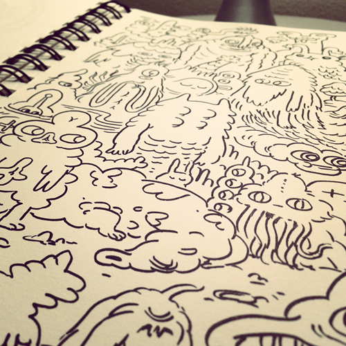
photo courtesy Moira Swiatkowski

Last weekend I was at the Maine Comics Arts Festival (MeCAF), where in recent years my bud and fellow Heeby Jeeby cartoonist, Dan Moynihan, and I make Free Monster Drawings for anyone who asks. We get a range of teenagers, adults, and kids—people of all ages, really. The two of us take requests and whip up fun little doodles with our shared set of Crayola markers. People seem to like watching us draw, and everyone walks away with a smile. I love it! I always forget to take pictures, but Dan snapped a few.

I recall one kid who was there with his parents. A budding cartoonist, he wanted to know if we had any advice for someone just starting out. At a show like this, I ask kids if they draw comics, and I tell them how easy it is to fold, staple, and photocopy their own books. I add that they should share what they make online if they can. And I say to simply keep at what they're already doing—keep drawing, A LOT.

But it has occurred to me, a better version of those 'keep drawing' words of wisdom we all tout would be to keep drawing, make A LOT of drawings, and don't worry about making bad drawings.

We all start out that way, and then at some point, someone gives us the idea to slow down and make careful drawings. That same someone introduces us to an astonishing technique: If you draw lightly with a pencil, nice and slow, you can work out all your crazy little details and nuances, and THEN you can ink over it with a pen or marker, adding even more detail! Once you're told that you can and should plan out your drawings, it sticks. Because it works! And you can put that eraser to use in the planning stage, too. Why wouldn't you work this way? It's how the professionals do it, right?


I've been keeping a sketchbook, one that I should really be drawing in more frequently. About a year ago I wrote about how I've been 
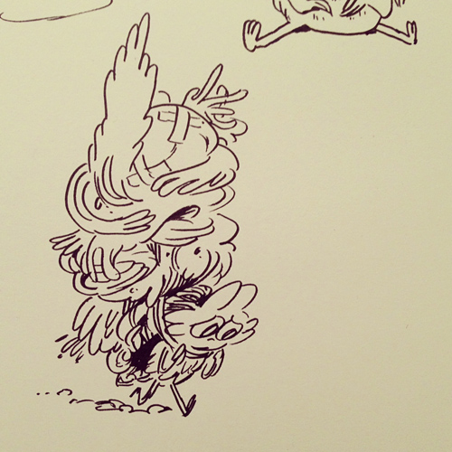
drawing more with markers—specifically, freehand drawing with markers. By which I mean, I put the pen to the paper and I improvise. I try to shut off that planning part of my brain, and I make it up as I got along. I invent. This is the same thing Dan I do when we make those monsters drawings up in Maine. It should be no surprise, this is what most people refer to as doodling. But I'd argue that a lot of artists aren't doodling enough. Especially if you spend a lot of time on the computer. If you hit UNDO, you're not doodling. You're not allowing yourself that free flow of blending one mark into another.


Now, I get that doodling is not for everyone. And there are plenty of styles of art and drawing where that planning stage is incredibly important. Roughing in your forms, blocking in your composition, shading, making thumbnails—these are all important steps to creating professional caliber paintings, illustrations, comics...you name it!

Where I think doodling is important has more to do with discovery. Trying things. Messing around. The more you do it, the more familiar you are with how you draw in general. The more spontaneous your ideas will be. It puts you in touch with your imagination. And it frees you up from that pressure of making mistakes. Because who cares if you make a mistake? Work with it! And if you make a bad drawing, there's still plenty more room in your sketchbook to make good drawings.

You don't have to doodle with a pen, brush, or marker, but I do think the permanence of ink switches that planning thing off in your brain. I work in pencil a lot, too—especially when I'm designing characters and roughing in a complicated pose or gesture. You can certainly make quick doodley marks with a pencil that carry a lot of energy. But when I get stuck, I'm now in the habit or breaking out a chunky Crayola marker. I fill up page after page of drawings until something sticks. I like to be able to look back at the mediocre drawings, too. Something that also gets lost with UNDO.


I'll wrap this up by bringing it back to kids...learning how to draw, having fun drawing, but also working at it—getting better at drawing. No matter how good you are, you will make a lot of bad drawings. Oftentimes, you have to pound through a rough patch of bad ones to arrive at that good one.

Draw without that light under-penciling. Forget about planning. Make time for doodling.

Monday, April 22, 2013

Vines


I finally got an iPhone in January, and just around that time, Twitter launched the fun little app which I'm sure most of you know about by now, called Vine. It allows you take 6-second looping videos, with one of the simplest UIs around. Download it. It's free. Look me up, if you do (bobjinx).

Everyone figured out pretty quickly that it's a great app for on-the-go stop motion animation, because you tap on screen to record in quick cuts. I created this vine last night, with a bunch of post-its. Note: these videos have sound—you have to activate it (when they are embedded in-browser) to turn it on and off. It's on rollover; you'll see it.

Here's my mess of a desk, just afterwards.

Here's another—a post-it test I did to try out the technique.


I've been messing around with Vine off and on for a little while.
Back when we had snow, I captured a few snow doodles.


And here's one of me doodling on paper with a marker.
(By the way, it's tricky to draw with a phone in your hand.)

Sunday, March 17, 2013

Evolution-Health: Sunburn


Ending the week of show-and-tell, here's the final set of designs from the Evolution-Health animations we made at FableVision for the New York Hall of Science. The last one is on Sunburn—why some of us ended up with pale skin to begin with, and what light-skinned populations can do to protect themselves from the sun. It's not often that bikinis and bathing suits pair up with educational science, but here goes.

In all of animations I had an interesting time playing with a cartoon style lighter on line construction. It's difficult for me to work completely in flat shapes, so I reserved line to help separate out those shapes as needed. You can see that her legs warranted more definition because they have overlapping forms.


This is what happens if you don't wear sun screen!


When you live closer to the equator, darker skin helps protect you from the sun's damaging UV rays. When our species migrated north from the African continent into Europe around 40,000 years ago, people evolved pale skin as a means to better absorb the noticeably weaker sunlight needed to create Vitamin D. So, it's an issue of where your recent ancestors lived on the planet.


But it doesn't make as much sense to go sunbathing in the cold north.


Still, that doesn't stop lighter-skinned folks from hitting the beach.


Eventually our protagonist learns her lesson, and shares this info with her other tanning friends. A squirt of sunscreen can do you a lot of good.


Thanks for following along this week. I'll let you know when the animations go up on the FableVision website, which should happen soon. You can see the designs from all four animations by clicking on the filter for NYSCI.

Thursday, March 14, 2013

Evolution-Health: Lactose Intolerance


The third in the series of Evolution-Health animations (created at FableVision for the New York Hall of Science) is on Lactose Intolerance, and probably the trickiest to explain. While a lot of us can digest milk well into adulthood, some of us cannot. Basically, we're all born with the enzyme to digest the lactose in our mother's milk when we are infants, but until tens of thousands of years ago, there was no reason to retain that ability once our mothers weened us. It wasn't until some cultures began raising livestock that animal milk became a valuable source of nutrition—people who could drink the milk were at a new advantage (thus, more apt to survive and reproduce). Those who couldn't, well—didn't do so hot with cow's milk.


I actually named these kids in the Flash file as I was drawing them. From left to right: Sam, Amelia, Danielle, Jason, Nikki, and Lily.


Nikki is not pleased.


Parts of Europe, Africa, and East Asia didn't partake in the whole animal milk thing and are now more likely to have difficulty with lactose.


Mooooooooo.


But, it ends on a happy note. The kids who can't drink the milk help themselves to some orange juice. (Yes, that's an orange juice mustache.) I can't take full credit for this gag—Margie Prager from Jeff Kennedy Associates wrote in the orange juice bit. I did add the pulp flecks.

Next up: Sunburn.

Wednesday, March 13, 2013

Evolution-Health: Obesity


If you missed my first post on Back Pain, this week I'm sharing some of the designs and layouts I did from the Evolution-Health animation project we created at FableVision for the New York Hall of Science. The second of the 4 animations we developed is about Obesity... specifically, the idea that we evolved the ability to store fat when food was scarce, and how that's become a problem in the modern world (at least here in America), where easy access to an abundance of high-calorie fatty and sweet food combines with an inactive lifestyle.


Obesity was the first animation I started design on. Initially there was a thought to have the contemporary characters have match with prehistoric counterparts (a fun idea). It ended up clashing with the some of the story set-ups, and was probably too cute. Including in this case, where we open on a couch potato but follow a smaller runt-type when we move to the past.


Below, an early storyboard sequence of the runt, running to catch up with the food.


This one has a great 'snarly-gorging' eating sequence (above). It ends on a family, happily chomping away on various unhealthy snacks. Note the baby with the soda.


Monday, March 11, 2013

Evolution-Health: Back Pain


Starting back in October of 2012, I began work on an assignment at FableVision that would quickly become my favorite project of the year. I've written before about the animation-science connection that happens often at my company—we often use film and gaming to teach educational concepts in a fun and entertaining way. I'm a big science nerd, and and even bigger animation nerd, so it's a dream when the two overlap. This was a collaboration between our studio and Jeff Kennedy Associates, who we'd previously worked with on a series of animations for the Denver Museum of Nature & Science (here and here). The exhibit, scheduled to first appear at the New York Hall of Science, discusses the relationships between evolution and modern-day health issues, such as back pain, lactose intolerance, and obesity.

Over the course of the week, I'll be posting some of my designs and layouts from the series, starting tonight with Back Pain. I went in wanting explore a cartooning style that was lighter on linework than I normally work. Another restraint: no texture. Keep it simple using flat colors. The project was drawn and animated completely in Flash (CS3, if you're curious). This short, and another one, feature ancestors like Homo erectus—so you can see why I had a lot of fun.


(I split this one up so you can see a few of the key poses.)


Next up: Obesity.