Showing posts with label rambling. Show all posts

Saturday, July 13, 2013

A-Camping We Will Go!

I have a new story in SpongeBob Comics #22 (in stores now!) and it's camping-themed. Around this time last summer, comics editor Chris Duffy asked me if I'd be interested in doing a comic with a poster spread in the middle—basically, a giant illustration. I'd just gone camping with some friends out on the Harbor Islands in Boston, so this is what I came up with. Below are a bunch of images which you can click to view larger, including the camping spread, which works as a pin-up poster.


I'll talk about color first, and then get into some of the sketches. Color has become increasingly important to me, which is sort of weird to say because it's always been important to me. But it's become an even bigger focus. I put a lot of energy into drawing, but I labor—probably over-labor—on color. I made a lot of specific choices going into this illustration. One may not seem like a 'color choice', but I decided early to stick with as much black line as possible—notable exceptions being the constellations in the sky and the blue line around the glow-jellies. I tried to balance bright yellows, blues, and pinks with neutral purples, browns, and greens. Some of these decisions may be at odds with official SpongeBob color branding (most characters use a colored line, and we're all familiar with flowery blue sky), but I always strive to stay true to the character designs and Bikini Bottom universe, which is full of campfire underwater-type gags. Not sure what to call it, but I had this image in my head of old Boy's Life and National Parks artwork, without any particular references in mind.


Here's my first sketch comp. A few interesting things to note—the 'claw' shadow in the lower left was originally supposed to be the enlarged claw of a little crab. But all sea animals in SpongeBob (besides the jelly-fish) usually take on humanoid forms. Besides that edit, everything else got in, which is great. I went with the Plankton bug-spray gag because it was more funny than the hammock. Staging it at night also meant I could use pockets of light to direct the flow—highlighting the individual gags.

Even though I've been doing most of my inking on the computer, I feel strongly about working the pencils on paper. I stuck two sheets of 11x17 copy paper together with tape, where I planned the whole composition, scanned it, and inked it in Manga Studio. You can see below, after talking with numerous folks including pals Chris Houghton and Dustin Harbin, that aliased bitmap lines are the way to go. I've made the switch 100%—and Manga Studio is perfect for inking directly in this mode. So much cleaner. This is also the first illustration I properly trapped and prepared for CMYK press, and it totally paid off. The comic printed beautify. Nice and sharp, and the colors are as close as I would ever expect.

This issue (#22!) features the likes of Maris Wicks, James Kochalka, Stephen DeStefano, and Joey Weiser to name a few. There’s more to my comic than what I'm sharing here (it has a beginning and an end), so pick up a copy if you see one at your local comics shop. My spread is smack in the middle.

Saturday, May 25, 2013

Thoughts on Doodling


photo courtesy Moira Swiatkowski

Last weekend I was at the Maine Comics Arts Festival (MeCAF), where in recent years my bud and fellow Heeby Jeeby cartoonist, Dan Moynihan, and I make Free Monster Drawings for anyone who asks. We get a range of teenagers, adults, and kids—people of all ages, really. The two of us take requests and whip up fun little doodles with our shared set of Crayola markers. People seem to like watching us draw, and everyone walks away with a smile. I love it! I always forget to take pictures, but Dan snapped a few.

I recall one kid who was there with his parents. A budding cartoonist, he wanted to know if we had any advice for someone just starting out. At a show like this, I ask kids if they draw comics, and I tell them how easy it is to fold, staple, and photocopy their own books. I add that they should share what they make online if they can. And I say to simply keep at what they're already doing—keep drawing, A LOT.

But it has occurred to me, a better version of those 'keep drawing' words of wisdom we all tout would be to keep drawing, make A LOT of drawings, and don't worry about making bad drawings.

We all start out that way, and then at some point, someone gives us the idea to slow down and make careful drawings. That same someone introduces us to an astonishing technique: If you draw lightly with a pencil, nice and slow, you can work out all your crazy little details and nuances, and THEN you can ink over it with a pen or marker, adding even more detail! Once you're told that you can and should plan out your drawings, it sticks. Because it works! And you can put that eraser to use in the planning stage, too. Why wouldn't you work this way? It's how the professionals do it, right?


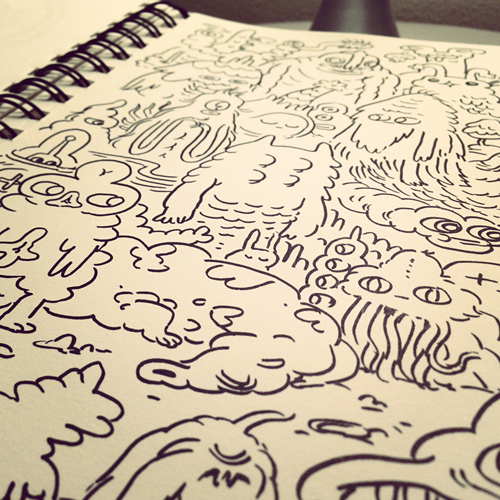
I've been keeping a sketchbook, one that I should really be drawing in more frequently. About a year ago I wrote about how I've been drawing more with markers—specifically, freehand drawing with markers. By which I mean, I put the pen to the paper and I improvise. I try to shut off that planning part of my brain, and I make it up as I got along. I invent. This is the same thing Dan I do when we make those monsters drawings up in Maine. It should be no surprise, this is what most people refer to as doodling. But I'd argue that a lot of artists aren't doodling enough. Especially if you spend a lot of time on the computer. If you hit UNDO, you're not doodling. You're not allowing yourself that free flow of blending one mark into another.


Now, I get that doodling is not for everyone. And there are plenty of styles of art and drawing where that planning stage is incredibly important. Roughing in your forms, blocking in your composition, shading, making thumbnails—these are all important steps to creating professional caliber paintings, illustrations, comics...you name it!

Where I think doodling is important has more to do with discovery. Trying things. Messing around. The more you do it, the more familiar you are with how you draw in general. The more spontaneous your ideas will be. It puts you in touch with your imagination. And it frees you up from that pressure of making mistakes. Because who cares if you make a mistake? Work with it! And if you make a bad drawing, there's still plenty more room in your sketchbook to make good drawings.

You don't have to doodle with a pen, brush, or marker, but I do think the permanence of ink switches that planning thing off in your brain. I work in pencil a lot, too—especially when I'm designing characters and roughing in a complicated pose or gesture. You can certainly make quick doodley marks with a pencil that carry a lot of energy. But when I get stuck, I'm now in the habit or breaking out a chunky Crayola marker. I fill up page after page of drawings until something sticks. I like to be able to look back at the mediocre drawings, too. Something that also gets lost with UNDO.


I'll wrap this up by bringing it back to kids...learning how to draw, having fun drawing, but also working at it—getting better at drawing. No matter how good you are, you will make a lot of bad drawings. Oftentimes, you have to pound through a rough patch of bad ones to arrive at that good one.

Draw without that light under-penciling. Forget about planning. Make time for doodling.

Monday, November 12, 2012

Early Color Memory


I just remembered something incredibly specific, and thought it was worth writing down. When I was a kid, maybe 5 years old, I recall waking up too early—likely when the sun was just about to rise (5 am?)—and being rather surprised by the visual appearance of my riding fire engine toy. I wish I could find a real picture of the thing, but I don't have it handy at the moment, and the internet isn't turning up the exact toy.

Regardless, the fire engine would've been mostly primary colors: red, yellow, and blue. The early morning light in the dark room shifted the way my eyes (and brain) perceived the colors in a way that I'm not sure I could ever experience again. Because I believe it was the first time I consciously recognized that the colors of my toy (and the world) could change. It seemed unreal, almost shocking—so much that I remember waking my tired brother to show him.

I can almost visualize it now, but I have a biased brain that knows that lighting changes colors. The image above is my best guess. At the time, I was surprised to see what was normally yellow become something closer to white. Also, that the blue seemed brighter than usual, and the red... very very dark. All my stuffed animals looked different too. I'm probably not exaggerating it enough to match the impact of my experience.

Whenever I woke up too early like this, I would bolt up excited to see all the weird colors. Over time, the effect wore off. I'm guessing my brain (as all of our brains do) has caught on to the fact and understands that the color RED changes in different colors of light—that I can still see RED as RED no matter what light I'm in, for the most part.

Odd post, but I'm wondering if anyone else has a memory like this. Color continues to be very important to me, so it's funny that the memory has stayed with me.

Sunday, May 27, 2012

Toon Boom Animate Tests

Before I dive in, I have a few things to say about Flash. For over 10 years now, Flash has been everything to me. And I mean that—a statement couldn't be more true. I literally owe my career to that program. I owe the development of my style as a cartoonist to it, too. I was first introduced to (then, Macromedia) Flash as a sophomore in college, on track to what I then believed was an editorial career in Illustration. As soon as I discovered I could make cartoons and games with a tablet and a (then, $99) computer app, things were never the same. This little app propelled me into a career in educational media, where I'm now an Art & Animation Director at FableVision Studios. Getting accustomed to drawing with the vector brush tool in Flash (recall, a tutorial) lead me to believe I should try working with a real brush on paper.

Now, those of you who know my thoughts on the program know how much I love Flash MX—the version released in 2002. I still believe it to be the best version of the app, as it has everything you need to animate without feature bloat—and the brush tool draws like butter. Flash CS3 is a close second, and in some ways I'm growing to prefer how the brush works in that version as I've been trying to ween myself off of MX (for fear that it will no longer be supported by modern operating systems).

Anyway, I ramble. Adobe has completely gummed up what was once great about Flash. CS4 was an absolutely abhorrent release (quite possibly the worst, with all of it's bugs and failures), and I curse CS5 like the plague. The interface alone drives me bonkers. So, as you might expect, I have low expectations for CS6. As I find myself at a decade mark, I've been increasingly curious to try something new.

Enter: Toon Boom Animate. People have had great things to say about this animation tool for at least a year or two (most notably, John K). I'm sort of surprised I've ignored it for so long; Toon Boom has a vast industry record in animation. Their tools have always been unique in that they truly aim to serve the needs and frameworks familiar to the animator. When I've tried to dig in to their apps in the past, I've always been put off by their clunky interfaces. Things have changed with Animate—or, maybe it's just familiar because it strives to be a bit of a Flash clone.

Below is my first attempt at animating with it—a test flight.

There are a few things I really like about Animate. I like that you can customize your brush (size, taper), and I like that it draws in a way where I don't feel the need to fuss over it. Unlike Flash, the brush maintains it's size in proportion to your zoom scale. This is something which never made sense about Flash that we all simply got used to. I like that it stores and remembers individual brush strokes—making them easier to select and manipulate if need be. I really haven't made an attempt at precision level inking, but so far, the brush tool shows a lot of promise.

Onion-skinning is pretty groovy—red behind, green ahead. I found it distracting at first, but it became more useful as I animated.


I'm really not digging into the bells and whistles of it yet, but it's fun to do straight-ahead animation. I suspect the true muscle of the program is in the realm of motion tweens, morphs, IK, and other computer animation tools. There are certainly layers of complexity in the app that has Flash never offered (like a stage camera). In terms of hand drawn animation, it's a pleasure to use.

At the risk of this post getting too long—consider me impressed and intrigued with lots more to explore. I'm writing in case others have been using Toon Boom Animate. If you have tips or advice (pros and cons), feel free to drop me a comment.

Wednesday, April 04, 2012

Close-ups


We rarely see art on the web at really high resolutions. Everything looks sharp and perfect, but relatively small. Even when we work on paper, we eventually scan and process our work via the computer. The impulse is to clean things up—to remove what appear to be imperfections in the digital realm. Make whites white— blacks black. Get rid of all the dust and scratches.


With this snow scene (posted at the end of 2011), I purposefully didn’t clean up the scan (inked on paper, by the way, with a Pentel pocket brush pen). I experimented with my coloring and layering on top of the ‘dirty’ scan to make the image look like it was silkscreened or letterpressed. It was fun!


These are all screenshots at a zoom of 100%, from a 600 dpi image in Photoshop.


I like that you can see the tooth of the paper and the jagged edge of the ink. Which is somewhat interesting to preserve on a screen, but entirely unnecessary in print.

As the web slowly becomes HD, I wonder if more artists will reject the impulse to clean things up. Or if we’ll become even more hyper-perfect.

The content of this post originally appeared on my tumblr.

Monday, October 17, 2011

Inktober is here again.

It's the month that comes only once a year, and by the decree set forth by Jake Parker (king and ruler over all that is Inktober), I've cracked open a much-neglected sketchbook and put INK to paper. Anything goes. Here's a small dent...


Ink forces you to commit in ways unlike other mediums. Something is black, or it isn't. And in a sketchbook, there is no turning back. Take these next two pages:

There are plenty of things I don't like about either of them, but there they are (numerous decisions I want to take back in plain sight). But there's no starting over on paper. Computers let you get rid of all those marks you don't like, instead of building on what you have. It's a very different way of making a drawing. And as much as I'd like to be able to go in and redo certain marks and strokes, I like that I can't.

If Adobe is listening, I would highly value the ability to password-lock the UNDO feature (thereby disabling COMMAND-Z). Set it on a timer, or something. (THE HORROR!!)

Trust me—it wouldn't be such a bad thing. The reason why you NEED undo is because the computer doesn't always get it right; it doesn't always translate your true intent. When you make a mistake on paper, it happens at your control at the tip of your brush or pen. The computer attempts to process your input, and there's a gap that exists between your brain and the screen (especially if you're still on an tablet, like me). One day that barrier will no longer exist, and then we'll remember the benefit of making a line and leaving it.

If you're traditional when it comes to inking, you have all sorts of methods in place for corrections (even if they're digital solutions), but I bet you're much more comfortable with your mark-making. If you're all digital, I challenge you to work with ink. Even if just for the next couple weeks. It's a good exercise to shut off the editing part of your brain—to just keep making marks until you're done. And then you move on to the next thing.

(don't ask.)

Tuesday, October 04, 2011

Elastic Character Design

So, we're looking at about 2 days since John K's animated intro to The Simpsons aired on Sunday night—and the effects haven't worn off on me yet. If you haven't already, definitely watch the couch gag...in a number of places (1, 2, 3), and read the interview he did with Amid Amidi on Cartoon Brew.

There are so many ideas to take away from the couch gag and the interview. Too many to discuss; all equally compelling. But one big point-of-interest is this notion of 'on-model' animation and drawing—where you follow a strict set of guidelines and formulas to recreate a character so that each drawing is consistent with the next. John K demolishes the rules that normally govern production on The Simpsons, and even breaks the internal rules of his own concoctions. He is explicit here in saying to avoid consistency.


(image courtesy Cartoon Brew)

This has HUGE implications when it comes to the production of animation—namely, whether or not to allow animators to distort or give individual voice to the drawings they create. And also, how consistent you want a character to appear from shot to shot. Some shows and directors allow more freedom than others. Most studios today arguably follow a rather strict 'on-model' approach (to which I might credit the impact of the productization of characters for merchandizing). The need to develop a system is understandable when you have a number of artists working in production.

It also got me thinking about how this applies to comics—where artists are also making an effort to draw the same character over and over again from panel to panel.

I will speak to my experience.

Here, a character is born—in multiples, as I posted a year ago.


No one drawing represents the character. Each drawing is a study in the design I'm trying to work out—which I do by moving the character around and giving him different expressions.

Fast forward to this summer, when I decide to feature a version of him in a comic called The Cave. You can read the full 8-page comic, here.


We all understand the importance of maintaining a certain amount of consistency so that the reader can follow the character from one panel to the next. But I try not to set hard rules for myself, because it's important to me that the acting of the moment drives how I choose to draw the character. I don't create a model sheet to figure out turnarounds. Instead, I get to know the character with each panel and with each requirement.

As an exercise, I've stripped out an assortment of images from this comic, isolating the character and giving him a uniform color treatment (in the comic, the lighting and mood required a variety of colors).


I would argue, with a good deal of certainty, that you should have no problem recognizing that this page features drawings of a single character. Sure, color acts as an aid, but that is a big part of his design in the comic—and definitely helps bind one drawing to the next. Even without color, he should be fairly recognizable as one character.


There are rules to his design, but they are not absolute. Features morph, eyes change shape, and arms may lengthen or grow a little. (He's a cartoon character after all.) Sometimes he has defined elbows, sometimes he doesn't. And again, no one drawing defines absolutely what he looks like. His design is the combination of all of these drawings and the variations within them. Which is why I'd call this an elastic character design, one that accommodates freedom for unique expressions and poses. The design is not rigid—allowing room for variation and fluidity from one drawing to the next. That said, the variation here is pretty conservative. It's not like I've given him square eyeballs in one drawing or he loses his lips in the next.

Comics are different from animation in that you see multiples of a character at the same time on the same page. But you can still get away with a certain amount of variation, just like you can in animation, and preserve the essence of the character.

Bringing this back to John K...he has reminded us that a huge part of what makes cartoons fun to look at is this elasticity in characters. I think he's challenged us all to think about what that means, and how far we can really take it.

Tuesday, November 24, 2009

Can someone pass the yams?

I'm heading up to Maine to visit the folks in a few days.
But first, a sketchdump:


You can't have a turkey without stuffing and rambling, so here goes...

A couple posts ago, Mike Rauch asked if I would weigh the pros and cons of inking traditionally versus digitally. This is a topic that's coming up more often these days, and I sense a growing number of cartoonists have a foot in both camps.

Maybe it's because I've been chained to the computer for so long, but it KILLS me how intuitive it is to ink by hand. Simply put the brush or nib to the paper and you know exactly what you're getting. If you make a mistake, you know exactly why it happened—nothing mysterious is going on behind the scenes. It's more nuanced and requires a level of concentration, but it's so natural to draw this way.

Flash, on the other hand, will always be a bit of a mystery. It took me a year or two to wrap my head around it, and it still frustrates me from time to time (how it reprocesses the line, in particular). But we all put up with it for the precision it offers, and the perfectionist's dream: UNDO. Not to mention the edit and transform tools.You can tweak and re-tweak a drawing until you're completely happy.

This is how I'm currently breaking it down.

I ink digitally when I sense the need for edits and corrections, which currently equals the majority of my client work. Flash is able to give me a clean professional line; I haven't achieved a similar level of slickness with the brush (yet). I don't have to scan and clean up my inks, so coloring is a snap. Flash is quick. Flash is sharp. It's what you'd expect from the digital realm. But even with the Cintiq, the computer has a long way to go in recreating the tactile connection between drawing utensil and paper. It will always be a mimic.

I reserve working traditionally for more personal work: namely, my comics. It's way easier to plot out the drawings on paper. I enjoy the craft of inking more than anything else. It's also valuable to have the physical piece to hold in my hands when I'm done. I think about my artwork trapped in zeros and ones and it really bugs me. Ideas come easier when I work them out on paper, which is why inking in a sketchbook is a bit of a no-brainer now that I have the brush pen. I rarely find myself doodling in Flash these days.

While I'm having a lot of fun inking on paper, I cannot deny the power, speed, and edit-ability of the digital realm. So I'm still very much a proponent of inking in Flash. But if you're a digital person, do yourself a favor: open up a sketchbook and put a pen, pencil, or brush to paper. For balance, if nothing else.

Happy Thanksgiving!

Saturday, October 10, 2009

College Days: A return to cartoons

Thanks to everyone for your responses to the 100 Figures Assignment post, and a special shout-out to Chris Houghton for tackling the challenge head-on (see the results). I've heard from a couple more people who've said they're giving it a shot, so best of luck.

Digging through my college portfolio, I unearthed a lot of artwork and memories—some of which I thought I'd share here. When I arrived at college in 1998, I was a kid excited about drawing cartoons and comic strips. But art school had slowly beaten into my brain that cartooning was a lesser art form (I'm sure others can relate). Throughout school I kept up with my comic strip, Blake (see related post), but it rarely crossed over into my college work.


I sensed an opportunity to burst out when I enrolled in the Illustration major junior year, but it wasn't until the end of Spring semester that a plan began to form. This was mid 2001—SpongeBob was on my radar, so I was watching a lot of cartoons again. I checked an illustration annual out of the library and found the work of Gary Baseman. Here was a professional illustrator who was appropriating a vintage cartoon aesthetic. I was working in St. Louis that summer and decided it would be fun to paint a cartoony carnival lunchbox for my then girlfriend (now wife), Loren.


(one of the first posts on Drip! featured this lunchbox)

The Baseman influence is pretty thick (I know). But something had clicked. I enjoyed drawing the exaggerated/distorted forms—especially the large eyes. I recognized that Baseman was tapping into something different than your generic everyday cartoons. And I studied it. More than anything else, I was now armed with a new justification for cartoonyness—if Baseman could get away with it as an artist/illustrator, why couldn't I?


Here's one of my first assignments from senior year, though I can't remember what it was for. Fortunately my professors got a kick out of it. And it felt good to be doing something fresh, while at the same time familiar. I was drawing cartoons again!


Above is an assignment shortly thereafter. This was for an article about internet pornography ruining marriages. The images are part pencil on paper, part digital. I drew with a soft lead, scanned it, and added flat colors in Photoshop. I was going for something that looked acrylic—a very different approach from the gouache paintings I was doing the semester before.

Below is an example of pencil artwork I first scanned...


...and then treated in Photoshop.


I looked everywhere for people who were doing vintage cartoons, discovering that underground comics were a good source for the weird and distressed look as well. I had a few issues of BLAB! handy, a shared copy of a RAW comix anthology in the studio, and I printed out everything I could find on the internet. I went direct to the source, too— consuming cartoons from the 20s and 30s when I hit gold with the Fleischer studio.

At the same time, I was drawing editorial cartoons for the college paper, Student Life, which whipped me into shape. I was assigned about 2 a week, turning around each illustration in a 24-hour period. It quickly became a testing ground. They were all accompanied by text, so the context will be somewhat lost.


There was also the alphabet book assignment, where I had to figure out how to arrange a lot of characters in a scene. I decided on a bug theme:

Ladybugs at the Laundromat


Bugs at the Bus Stop


A Tick Directing Traffic


My "Jinx the Monkey" cartoon would be the culmination of everything. The best way to investigate old-fashioned cartoons would be to make one. I've embedded it below for viewing purposes (for the first time on this blog, actually!)


(apologies for not having playback controls, it's about 3 minutes)

It's hard to believe that bugger is almost 8 years old now. Working in Flash lead to drawing in Flash...blah blah blah...I'm still drawing cartoons today...pretty much for the same reason. They free me up; I don't have to make excuses for drawing weird expressive characters. And it's what comes naturally.

That should be enough rambling to last you the long weekend. I hope this was in some way interesting. The advice I give to every artist is do what you know and love—don't just copy or follow a trend because it strikes you at the moment or seems marketable. Your work (and mind) will be better for it.