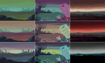
Here are some rough color studies for a side project I'm working on with my friend, Taryn Johnson. We're basically going with my first instincts (top row), but I have a lot of fun exploring other options just messing around in Photoshop, which often spawn other color ideas.


3 comments:
These are awesome. I personally like the second row best. Maybe it's the mix of warm and cool colors, whereas the top row looks a bit monochrome to me. How do you get such nice painterly effects in Photoshop, or do you use something else for the rendering? I'd appreciate any tips or tutorials you could point me towards. PS, got the comic in the mail. Thanks. It's kick-ass!
Hey, thanks! I hear that—when I paint the finals I'll probably be picking from all over. I like something about each of them.
I painted these in ArtRage. If you hop down to the previous post you'll see more about that. It's a great app—cheap, and easy to use.
Glad you got your book! You may be on the record for having the Heeby Jeeby that's traveled the farthest so far :)
Cool, thanks. Haha, well I'm spreading the word so hopefully it won't be the last far-flung purchase.
Post a Comment