
Friday, December 28, 2007
Friday, December 21, 2007
Sunday, December 16, 2007
Favorite Albums of 2007
I tried this last year and it was kind of fun, so here goes (I'm not normally one to write about music, so bear with me).
Top Ten Picks:
- Animal Collective: Strawberry Jam
This year I was on the lookout for music that would grab me. Animal Collective's Feels currently stands out as one of my favorite albums, so I was anticipating nothing short of amazing from these guys, and they delivered. I'm at a loss to describe this album. On the surface it sounds loud and primitive—almost tribal. They take something perfect like a pop song and distort it until it's almost unrecognizable. Harmonic tones, hoots, and screams work seamlessly together. My connection to this music is probably grounded in a fascination with art that can be both beautifully striking and grotesque at the same time. They manage to find that musical pleasure point in my head. Take it for a ride if you're looking for something strange but powerfully fulfilling. - Of Montreal: Hissing Fauna, Are You The Destroyer?
This is as close to pop ecstasy as I want to get. Kevin Barnes takes it up a notch as he ventures into a funkier, bouncier sound. It's dark at times, and more personal. Sticking with the "music that grabs you" criteria, this was the album I couldn't get out of my head for weeks after I first listened to it. Melodies play like candy that you can't get enough of. It's catchy, fun, and weird (noticing a pattern yet?). - M.I.A.: Kala
I was head-over-heels with her last album, Arular, so again, big expectations here. You can tell she had something larger to say on this album, as her artistic voice is more present. The dance hooks are still there, but this is a bumpier more scattered landscape. I'd almost consider it the dance counterpart to Strawberry Jam if not for it's tribal beats alone. It's political and demands your attention...AND you can dance to it! - Spoon: Ga Ga Ga Ga Ga
This was the surprise album of the year for me. Straightforward, driving, perfectly crafted indie rock. And so refreshing! These guys just keep getting better. - Caribou: Andorra
A great album for so many reasons. It hearkens back to 60s psychedelic pop with a electronic update that feels contemporary. It's hypnotic, almost daydreamy. I usually listen to it when I'm on a long drive (maybe that's not a good thing). - Radiohead: In Rainbows
Undeniably Radiohead, with a subtler approach for a change. It takes a couple listens to get into because it's more subdued. A stunning album, nonetheless...and fun to download. - Feist: The Reminder
Beautiful song-writing, lovely voice, catchy melodies...so likable that Apple snatched her up to launch their new iPod nanos. This one is more diverse and ranging than her last album, which is great. Best of all, you can listen to it when your Mom's in the car! - Kanye West: Graduation
I'll admit I was hoping for more from Kanye, but he still delivers one of the best hip-hop albums of the year. And amazingly he continues with a fresh sound. - Panda Bear: Person Pitch
It's probably not fair for the guys from Animal Collective to make it into two spots, but so what. This sonic beauty is the brainchild of Noah Lennox, better known as Panda Bear when he's with the band. I don't think I've fully grasped what it's about, but it's sonically one of the most ambitious experimental albums I've ever heard. It shares a melodic likeness to Brian Wilson—layers and layers of instrumentation, sounds, and lyrics. At times it's a bit too much to digest in one sitting. But again, it reaches to the core of everything I look for in music. And its perfect to listen to when I work on my art. - Architecture in Helsinki: Places Like This
This was by far the most fun album I listened to all year. I got an energetic preview of it at a live show last spring that I'll never forget. The album doesn't quite recreate that energy, but it comes close. They've channeled the B52's on this one and it definitely makes you want to get up and dance.
Also worth checking out...
(if ten would allow more)
Wilco: Sky Blue Sky
The Go! Team: Proof of Youth
The Shins: Wincing The Night Away
Okkervil River: The Stage Names
Lavender Diamond: Imagine Our Love
Modest Mouse: We Were Dead Before the Ship Even Sank
The Clientele: God Save The Clientele
Feel free to leave your personal list of favorites in the comments section. I'd love to hear what people are listening to outside of my sonic bubble.
Thursday, December 06, 2007
Comic Droplets

I arrived home from work today to find a small mysterious package at my doorstep. I looked at the label and saw that it was from a close friend of mine, Crissy Cinciripini. She had ever so carefully cut up a comic of mine that appeared in an issue of Nickelodeon Magazine a year or so ago and made miniature glass magnets out of them. It's peculiar but quite pleasurable to see my comic morsels in nugget form. At the proper angle, they appear like droplets. So much fun! I have yet to thank Crissy. I'm curious what spawned this act of generosity, though for my birthday, she once cut up another one of my comics and collaged it onto the surface of a jar that she filled with candy.


Tuesday, December 04, 2007
Friday, November 30, 2007
Telephone Pictionary
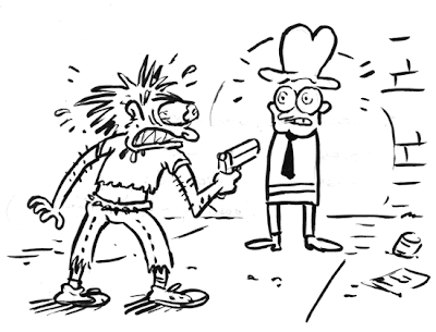
"A cracked-out, drug advocate sticks up a man with no hands and a nice hat."
There were some great doodles by fellow co-workers. The person after me wrote "Say hello to Myrtle," and it ended on "Slow readers make happy people."
Wednesday, November 28, 2007
I Return Anew...
 So, I begin where I last left off. It's been awhile since my last post—sorry for the interuption. I spent the greater part of the month in the tropical paradise of Hawaii on a honeymoon with my lovely bride, Loren Lee. And since my return to the bitterly cold wasteland I delightfully call Boston, distractions have included, amongst other things, the newly released Super Mario Galaxy for Nintendo Wii. So, it's time to take out the trash, give this pumpkin a propery burial, and get back to blogging. Look for a new entry soon.
Thursday, November 01, 2007
Wednesday, October 31, 2007
Customized Comics

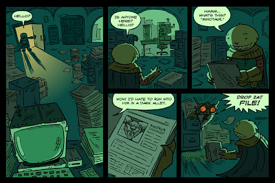
The notion of creating and customizing an avatar is almost ubiquitous in gaming these days. Especially with the popularity of Nintendo's "Mii" feature, where you make a cartoony version of yourself, so when you swing the bat you connect with the character on screen. Have you ever heard of a comic you can customize? I've been working hard for the last year or so with my friends at FableVision, and more closely with Keith Zulawnik, on an educational game that incorporates this very idea. The story component of the game is delivered using comics, and the character you build gets inserted into every panel. In the page above, even your pet gets customized.


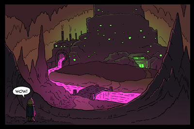
There's been a lot of drawing and coding tricks, and the work is really paying off. The visual style is a blend of Keith's character design and my line quality. They are all drawn and colored in Flash, which was a first for me. I'm really happy with how they're turning out. Below is a more direct example of what I'm talking about. I can only hope that kids will appreciate all the hard work.

Tuesday, October 23, 2007
Cafeteria Rumor Mill

I'm featured again in the November issue of Nickelodeon Magazine. This is a cartoon about how food rumors start in the cafeteria. I had to strategically leave space at the top and around the characters for various word balloons, which the designers added afterwards. It printed a little too green, but I guess that's okay, because it made the food look more gross. My favorite character is the crazed one.
Friday, October 19, 2007
The Genius of Tintin
 My co-worker and friend, John Lechner, has some thoughts on Tintin that I'd like to share with all of you. He just completed and posted a short essay on his website, which can be found here. He sets out to focus on Tintin as a "unique comic creation." Rather than delve into a biography on Hergé as many have done in recent years, he writes about the comics on their structural and narrative merits:
The similarity in the comic panels, which hardly vary in size or perspective, give the stories a documentary-like quality, as though the viewer is there watching the action from the side. Close-ups are rare, unusual camera angles are rarer. But the flow of the action is effortless, and Hergé can cut back and forth between scenes like an expert film director. The simplicity of the layouts makes for quick reading, as the reader never has to decipher a page or puzzle out experimental designs. While this won’t win the author many design awards, it does serve the stories well, and the story is the most important thing to Hergé. Even the smallest background details are there to serve the story.
Unlike John, I didn't grow up reading Tintin. I grew up watching cartoons (good and bad) instead. But in recent years I've acquired great admiration for Hergé's perfection of the adventure/detective comic. The stories are easy to follow while engaging for readers of all ages. John touches upon page layout. I too am a believer in the grid, and I look to Tintin when I construct my own comic layouts. In particular, I love it when Hergé leads you from one tight panel to the next, and then opens to a beautifully detailed full page illustration for key moments. His page construction is efficient, simple, and to the point. Plus, he allows his characters to exist full figure in the panels. Headshots are rare. And above all else, the drawings are fantastic. This spread from Tintin in Tibet is by far one of my favorites. All the comic pistons are firing!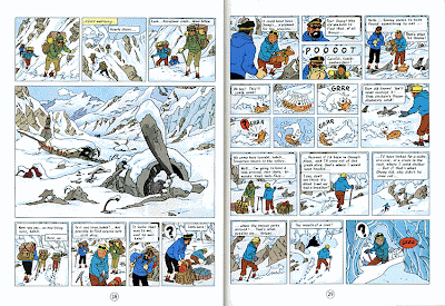
Most of all, I love that Tintin doesn't pretend to be anything else but a comic. It doesn't read like the storyboard for a feature film. Characters don't leap out of the frame borders. It's comfortable being what it is—modest, yet genuis at the same time. Thanks again, John, for sharing your thoughts with us!
Images courtesy of Hergé
Wednesday, October 17, 2007
Friday, September 28, 2007
Monday, September 24, 2007
Gross Anatomy

This is an illustration I did for the October 2007 issue of Nickelodeon Magazine, full of all sorts of fun gross stuff. The image goes along with an activity where you get to choose a word from three columns to create a symptom. In this case: Burning Nostril Slugs. On the same page (13), Aaron Renier has some awesome illustrations of body creatures, which he has up on his website (1, 2, 3). Nice work! When I got the call from NickMag, they literally said, "Wanna do a gross illustration for us?" Definitely a fun issue to be a part of!
Wednesday, September 19, 2007
New Comic in ARGH! #3
Thursday, September 13, 2007
ARGH! #3

I just got word from Félix that ARGH! #3 is invading Spain as we speak. He's politely asked me to wait a bit until I post my comic on the web, but you can head on over to the Flash website he and Jorge created for Issue #3, where they have previews of all the artist's comics (click on the yellow book, and then "Autores"). There is also a new online store for those of us in the states who are interested in ordering a copy (only 5 euros!). I have yet to see the magazine, but it looks like a winner—a variety of styles in black and yellow duotone. I'll post my full comic here at Drip! in the next couple of weeks. All of you in Spain should run out and get a copy!
Wednesday, September 12, 2007
Thursday, September 06, 2007
Goldisocks

Once in a while a dream assignment comes your way, and this was surely one of them. I worked on a game over a year ago with the immensely talented Sharon Emerson, who should be credited with all the fun, wit, and inception of the idea. Goldisocks is one of many Flash activities we collaborated on at FableVision to help teach science concepts to kids. Our approach was to use story and humor to convey the definitions of temperature and heat. She came up with the idea of a girl in a cafeteria who's measuring the temperatures of bowls of porridge, and Goldisocks was born. I've included a link to the game below. Enjoy!
--> Play Goldisocks
Monday, September 03, 2007
I Yam What I Yam...

This weekend I finally got my hands on the newly released and restored Popeye the Sailor DVD set, featuring 60 cartoons from the Fleischer period (1933-1938). And boy are they great. I've never been a die-hard fan, but I'd consider myself a convert. For what one might say is a pretty repetitive formula (enter Popeye, Olive Oyl in distress, enter Bluto, fist-fights, walloping, more fist-fights, enter Spinach and theme, Popeye saves the day), the shorts are incredibly inventive for their time. The animation, scene-planning, musical timing, luscious backgrounds---heck, everything about them are a pleasure to watch. I found myself freeze-framing in several spots to appreciate the keyframes.
I haven't gotten through all of them yet, but one in particular, Popeye the Sailor Meets Sinbad the Sailor (1936), really caught my attention. I won't link to YouTube because the color and compression are just awful by comparison. It's one of the few Technicolor and long format cartoons included in the DVD set. While it's not the funniest of the bunch, there are some great monsters and ugly expressions coming out of Bluto in particular. So, during some freeze-frames, I did a little sketching. Which you will find below. I find this to be a fun exercise, especially to study the cartoon forms.

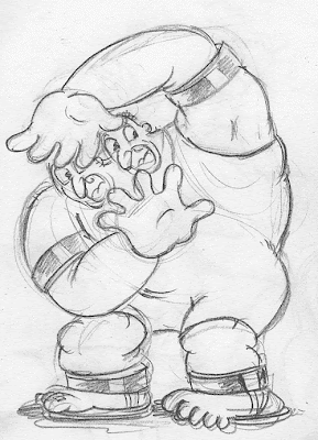


Ha! I just realized I didn't even draw Popeye. Oh well.
I'd recommend the set to all fans of early cartoon animation. I wrote an earlier post which included links to some of the buzz on other animation blogs.
Saturday, August 25, 2007
Man or mouse?

I drew up this image for the "Toonistration Contest" over at Graphic Tales. As part of the discussion on what makes an illustrator different from a cartoonist, Dan Zettwoch commented that "there is...a pre-supposition that cartoonists draw bug-eyes and sweat droplets and illustrators cross-hatch pirate scenes." Hmmmm. Playing off that riff, D.B. Dowd has put forth a call to arms for artists to construct a hybrid of sorts. So, this monstrosity is my cross-hatched concoction. Contest "winners" will be posted on September 3rd at Graphic Tales.
UPDATE: Contest results and continued discussion on the topic: here
Tuesday, August 21, 2007
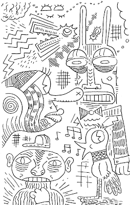
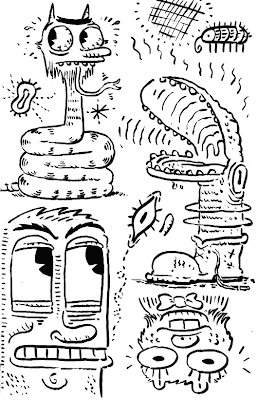
More on Line...
Monday, August 13, 2007
A Solitary Cephalopod

*Mental note to lay off squidlike creatures for awhile. And I'm becoming self-conscious of my "one-eye" tendencies. When I'm doodling, I normally start with the eyes. I find that it's fun to see how much expression you can get out of a cyclops. But I fear that I'm doing them a disservice by denying them any depth perception.
Saturday, August 11, 2007
Illustrator, Animator, or Comic Artist?
I'm most comfortable making pictures—that I can be certain of. But when I want to tell a story or a narrative, I'm increasingly more enamored with the frameworks of animation and comics—in essence, not wanting to rely on a single image to deliver an idea. Is this a failing of me as an Illustrator?
While filling up sketchbooks and exploring a variety ways of making lines and constructing images, I'm comfortable with what I guess is my developing style. And while I recognize my influences, I can't help but wonder why it is that I am so profoundly drawn towards comics and cartoons. The visual languages are definitely similar, and they both arrived in popular culture at around the same time (turn of the 20th century, give or take...animation a decade or so later). I work in flat color and line, but do I value them for their intrinsic characteristics or because I love cartoons and comics?
Without trailing on too long here, I've decided that maybe the word to best describe my trade is "cartooning," making me a Cartoonist. This is what a lot of the earlier pioneers described themselves as (artists like Winsor McCay, T.S. Sullivant, Otto Mesmer, and Milt Gross come to mind). And most of them dabbled in the realms that I'm interested in (Illustration, Animation, and Comics). Not that I need to label myself anything. Perhaps it's more of a exercise in knowing where I fit it in with my predecessors and contemporaries.
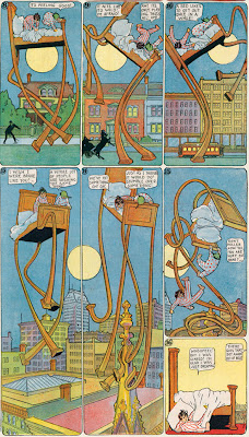
Winsor McCay

T.S. Sullivant

Otto Mesmer

Milt Gross
Funny, though, because I wouldn't consider any of these guys direct influences—who with the exception of Max Fleischer and George Herriman, are predominantly contemporary. So for now, I guess I'm a Cartoonist. That may change tomorrow.
UPDATE: D.B. Dowd furthers this discussion over at Graphic Tales. A new blog all of you should get acquainted with.
Thursday, August 02, 2007
Tuesday, July 31, 2007
Swing You Sinners (1930)
I just learned how to embed a YouTube video, so I figured why not take a moment to showcase some classic animation? This is a Fleischer short from before the more famed days of Bettie Boop and Popeye. It features a bopping jazz soundtrack, great visual gags, and lots of surreal animation—all the elements Fleischer Studios is best known for. Be sure to watch it to the very end, as there is a really bizarre finale. The Animation Archive offers a Quicktime version with less compression: view it here. They also have this to say about it:
One of the films preserved with the assistance of ASIFA-Hollywood was the classic Fleischer Talkartoon, Swing, You Sinners. Animated by Ted Sears and Willard Bowsky, with an eye-popping surreal ending by Grim Natwick and Bowsky, this film was the first of many Fleischer cartoons that mixed surrealism, cartoony ghosts & goblins, and hot jazz. While other studios built their cartoons around fairy tale stories or topical gags, the Fleischers constructed cartoons in the same way jazz music was constructed... statement of the theme, a series of variations and a big finish.
Thursday, July 26, 2007
Thursday, July 12, 2007
ARGH! Teaser

I just completed my latest 2-page comic for ARGH!, a Spanish comic magazine. Issue #3 will be all in black and yellow with no words this time around, because they want to distribute it all around Europe. Lucky me, because I love doing wordless comics. Félix tells me that he got a ton of submissions this time, and the quality continues to improve. This time I drew up a comic more in the spirit of the magazine, which leans towards the grotesque. The above panel is a teaser to hold you over until the magazine comes out in a couple of months. (Will the wait pain you nearly this much?...I can only hope!) You can see my comic for ARGH! #2 at this earlier post.
Saturday, July 07, 2007
A Robbery! (continued)
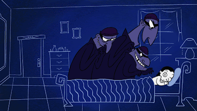
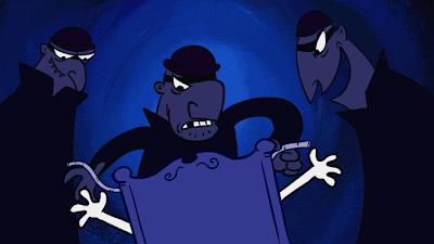
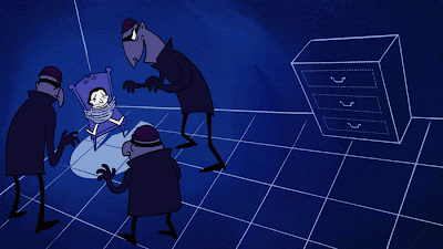
UPDATE: You can now view the full animation a this post:
A Robbery! (animated)
Popeye Restored
.JPG.jpg)
.JPG.jpg)
.JPG.jpg)
UPDATE: John K has some great insight about Popeye, and the soon to be released DVD on his blog as well. Check out these posts:
(Popeye Rules) (What makes a character?)
Monday, July 02, 2007
Doctor Velcro

This is a one-pager that I just inked up in honor of my friend, John Lechner (if you don't know by now, he's the amazing comic artist and creator of Sticky Burr). I thought it would be fun to do a little Sticky Burr comic of my own, featuring the nefarious evil-doer Doctor Velcro. Nothing like the real deal, though. This was all in good fun. I have to hand it to John, it ain't easy drawing all those little burrs!
(click to view larger image)
Renée Kurilla, artist cohort and FableVisionary extrordinaire, also fashioned a plush Sticky Burr, which you can see at her blog.


