This is no joke.

These creatures exist.
This is the ocean sunfish, otherwise known as the mola mola. They are the heaviest bony fish in the ocean—weighing upwards of 5000 lbs! HUGE! Just look at the diver by comparison.
They've been spotted off the shore of Boston.
They may even live in an ocean near you.
And they creep the hell out of me.
It all started when I was a kid. The thought of swimming with fish scared me to begin with. When I would go swimming in the lake, I'd imagine fish gracing by my feet, ready to nibble away at me—especially if I swam out over my head.
I was reading about fish in an encyclopedia (this was what we used before Wikipedia, kids), when I came across an illustration not unlike this:

http://www.feenixx.com/sealife/fantastic_fish-poster.htm
"The Fish of the Ocean" it was called—a full page illustration showing fish of all shapes and sizes. And there is was. It was labeled "Ocean Sunfish." I just couldn't make sense of it. Its body design is so bizarre, it defies explanation: no tail fin; two huge fins jutting out the top and bottom. The drawing was larger in scale than what is shown here.
But this is where the real freak-out kicks in. I imagine a scenario where I'm out in the ocean, snorkeling, when off in the distance I see a white shape that grows larger. And larger. Before I know it, I'm swimming alongside one of these...fish. In fact, the horror is pretty well simulated in this video. The beast appears around the :54 second mark.
Watching this sends chills up my spine.
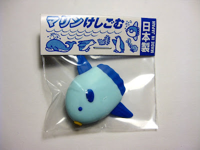
It should come as no surprise that no one takes my fear seriously. My wife has known about it for some time, and was thoughtful enough to buy me this:

They are not CUTE.
Mola mola will kill your family according to one group of enthusiasts.
(thx @Tarynosaurus)
So...I was tweeting about how I can't stand these mola molas the other day. The taunting continued. And then one fellow (@Abraxas579) thought maybe I could overcome my phobia by drawing one. It was an intriguing proposal, and I do enjoy drawing gross things, so I decided to take him up on it.

Some preliminary sketches.

WAIT! How'd that get in there?

I landed on this drawing. And then inked it. But I prefer the pencil.

I guess I have a better appreciation for their awkward body design now. But you won't catch me in the water with one any time soon.
Fear the mola mola. As I do.


