My co-worker and friend,
John Lechner, has some thoughts on Tintin that I'd like to share with all of you. He just completed and posted a short essay on his website, which can be found
here. He sets out to focus on Tintin as a "unique comic creation." Rather than delve into a biography on Hergé as many have done in recent years, he writes about the comics on their structural and narrative merits:
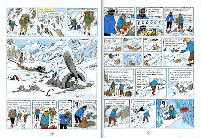
The similarity in the comic panels, which hardly vary in size or perspective, give the stories a documentary-like quality, as though the viewer is there watching the action from the side. Close-ups are rare, unusual camera angles are rarer. But the flow of the action is effortless, and Hergé can cut back and forth between scenes like an expert film director. The simplicity of the layouts makes for quick reading, as the reader never has to decipher a page or puzzle out experimental designs. While this won’t win the author many design awards, it does serve the stories well, and the story is the most important thing to Hergé. Even the smallest background details are there to serve the story.
Unlike John, I didn't grow up reading Tintin. I grew up watching cartoons (good and bad) instead. But in recent years I've acquired great admiration for Hergé's perfection of the adventure/detective comic. The stories are easy to follow while engaging for readers of all ages. John touches upon page layout. I too am a believer in the grid, and I look to Tintin when I construct my own comic layouts. In particular, I love it when Hergé leads you from one tight panel to the next, and then opens to a beautifully detailed full page illustration for key moments. His page construction is efficient, simple, and to the point. Plus, he allows his characters to exist full figure in the panels. Headshots are rare. And above all else, the drawings are fantastic. This spread from Tintin in Tibet is by far one of my favorites. All the comic pistons are firing!

Most of all, I love that Tintin doesn't pretend to be anything else but a comic. It doesn't read like the storyboard for a feature film. Characters don't leap out of the frame borders. It's comfortable being what it is—modest, yet genuis at the same time. Thanks again, John, for sharing your thoughts with us!
Images courtesy of Hergé


