Before we dive in, I want to take a moment to thank everyone for the feedback I received on my
first Flash tutorial. Special thanks go to the folks over at
Drawn! for
picking up that post, so it could reach so many people. My goal in this lesson is to explain some of the nuances of coloring Flash. If you've started drawing, the odds are you've already jumped ahead and started coloring—not a lot to figure out in that regard. But there are a few tools and methods worth exploring. So here goes!
216 Colors (and then some)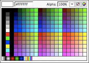
Because Flash was designed for output to the Web, coloring is exclusive to RGB. You won't find CMYK around these parts. In fact, Flash is really tailored to
web color. You'll notice this right off the bat when you go to select a color in the Tool palette (note there are options for both
shape fill and
stroke). There are 216 uniformly distributed hexadecimal colors to choose from. Now, we all know web colors aren't the prettiest palette to work with, which is why I'll point you directly to the color wheel icon in the upper right corner of the palette box. Selecting this will pop up various options for mixing color, which will be different depending on your OS. On a Mac, it will bring up the color wheel by default. I tend to gravitate to slider bars, so I opt for the second option. Here, you can choose between Grayscale, RGB, CMYK, and HSB—much like Photoshop. Remember that you're in an RGB color space no matter how you mix. Flash will always assign a hexadecimal code to your color. You can even enter a code if you have a specific color in mind. Another setting is your Alpha percentage. This lets you change the transparency of your color from 0 to 100%, allowing you to color in thin washes.
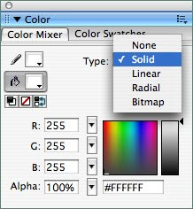
You can also adjust color with the Color Mixer window. It gives you a bunch of options to play with, all in one space: RGB sliders, Alpha controls, the full spectrum of possible hues and saturations, a value slider, and a hexadecimal code. There's also a dropdown menu labeled "Type." It will be default to "Solid" for solid color, but it also has options for "Linear" and "Radial" gradients, as well as a "Bitmap" mode for fill patterns. Flash handles gradients well enough, but the controls are a little weird and take some getting used to (I'm not going to spend time on it in this post). You can use the Gradient Transform tool to rotate, stretch, and manipulate the boundaries of your gradient. Adobe added new functionality in CS3 that is similar to how Illustrator handles them, which is built into the Paint Bucket tool (just click and drag in a direction). My pal,
Keith Zulawnik, is a master of working with gradients in Flash. You can view samples of his Flash illustrations
here and
elsewhere on his blog. I'm trying to convince him to do a little tutorial of his own. But I don't work with gradients much, so we're going to move on.
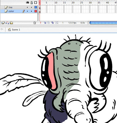
The Two Approaches to ColoringThere are basically two ways of coloring a drawing in Flash. You can either color on
multiple layers, or on the
same layer as your line art. How you choose to color will depend on where you're coming from (habits from other apps), what you're coloring, and what the end goal is for your finished art. I will guide you through both approaches, weighing the pros and cons of each method.
For those of you coming from Photoshop, you'll likely gravitate to the multi-layered approach. This should be familiar territory, because layers work the same in Flash minus some of the fancier perks of Photoshop. Simply create a new layer underneath your line art layer, select the Brush tool, and start coloring!
You can add as many layers as you want, and people who like painting with transparency will find themselves right at home. In fact, if you want to paint with transparency, this is the way you
have to go (I'll explain later). I recommend the multi-layered approach if you want to preserve your line drawing, or if you absolutely must use more than one layer to get the job done. But that's basically where my recommendation ends. You might as well export your line art to Photoshop, because it's better equipped for this kind of coloring (unless you need to work in vector). The approach, while super safe, doesn't take advantage of any of the benefits Flash has to offer.
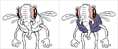
The second approach is to color on the
same layer as your drawing. Why on Earth would you want to do that, you ask? First off, Flash offers something I haven't seen in any other program—a little feature called "Paint Behind." I neglected to mention this in the
Brush tutorial, but you can change what's called your "Brush Mode." Click on the drop down, and you'll see the following options:
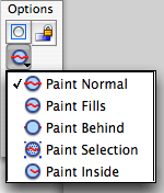
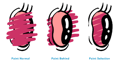
Flash is set to "Paint Normal" by default. It does what you would expect; whenever you paint a new stroke, it will paint on top. Change your Brush color and you'll see what I mean. The two options I want you to pay attention to are "Paint Behind" and "Paint Selection." I rarely if ever use the others, but they are there if you want to experiment. "Paint Behind" is one of the best things Flash has to offer in the way of coloring fast and coloring loose. By using this setting, each time you paint it will always go to the bottom of the pile. So it's ideal for painting underneath your line. To use other option, "Paint Selection", simply select the area you want to color on (it will highlight fuzzy), and whatever you paint will only appear in that region.
Now, "Paint Behind" probably sounds awfully similar to creating an additional layer and coloring underneath your line art. In many ways,
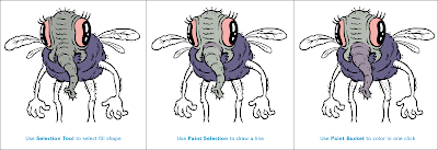
it is! But when used in combination with Flash's other coloring weapon, it's power is truly unleashed. Like every art application, Flash has a Paint Bucket tool, which by convention will completely fill in the shapes of your drawing for you. Select it, and you'll see a dropdown with a circle icon appear under Options. These are your Fill options:
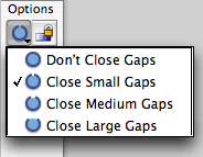
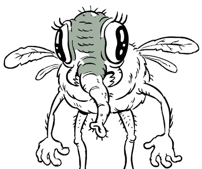
The Paint Bucket will be set to "Close Small Gaps" by default. What this does is try to fill in shapes with a color, even if you have small gaps in your linework. Not all of us draw with lines that are perfectly connected. If you have really large gaps in your linework, you might try "Close Large Gaps." But it can only do so much, and you'll end up with something like this:
Here's where "Paint Behind" comes into play. The fastest way to color in Flash, in my opinion, is to start clicking around with the Paint Bucket to see what you can get done first. If you click on something and it doesn't fill with color, it means the gaps in your line are too big. So, take your Brush, set it to "Paint Behind", and use it to fill in those gaps!
It can be hard to spot them all, but there usually aren't that many. If you seal up the gaps, and use the Paint Bucket again—voila! Colored in one click! Whatever else you can't get done with the Paint Bucket you can do manually with the Brush. The Paint Bucket tends to work better when you are zoomed out.
The final component of this same-layer approach uses the Brush Mode "Paint Selection." Use it when you want to paint over only a shape area that you've preselected. It is particularly useful for coloring over something when you don't want to color over the line.
It's also handy if you want to change your line color in a spot. Just select a line segment and paint over the part you want colored.
Weighing the ApproachesWhat are the advantages and disadvantages of each approach? I tend to consider speed above all else! If you resort to painting manually on multiple layers, it's going to be more labor intensive. You'll need to make sure you don't miss a spot, and you'll probably color just barely inside or outside the line (which may be undesirable). Also, don't forget we're in an animation program here! Your animation workflow will typically be much smoother if you keep your line and color together. Let Flash fill your linework for you if it can! Animation is time intensive as it is, so you don't want to spend time manually coloring if you don't have to. Some styles warrant it, especially ones that are visually complex, loose, or painterly. But if you're a cartoonist working in a style like myself, you want to lay in crisp solid colors, so the Paint Behind/Paint Bucket combo is generally the way to go.
The big disadvantage is that once your combine your line and your color, it can be tedious to go in and select all of your line art again. You'll have to manually
shift select bits and pieces of it.
One trick: Select the entire colored drawing, and then
shift deselect everything but the line...it should go quicker. You will notice here, if you haven't already, that different colored Flash shapes slice into each other when they overlap or intersect each other. Here's what it looks like if I take apart my line from my color:
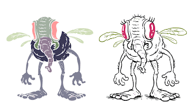
This is another oddity which I believe is unique to Flash. Most other vector drawing programs treat each vector stroke and shape as a separate "indestructible" object. Not the case in Flash. You can turn auto-grouping on if you like, or manually group objects (Command G) to protect them from being sliced into. Another consequence of this slicing issue is that using alpha transparency will
NOT work if you color over a color on the same layer. For example, if you have a solid green that you want to shade with 40% transparent black, you might expect something like
A but you'll end up getting
B:
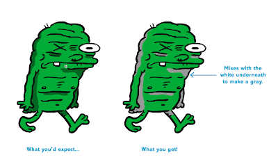
This is because when you paint on top with a new color on the same layer, it overwrites the color underneath (basically, deleting it). In this case the black is not mixing with
green, it's mixing with the
white of the background. Weird, right? The lesson here is that you should use the multi-layered approach if you desire to paint with transparency. The proper way to color this guy on the same layer is to mix the darker green on your own.
I actually use
both approaches. When I'm animating, I almost exclusively color on the same layer. It's about 50/50 when I'm doodling or drawing an illustration. I can be very precious about my linework, so I don't always want to combine it with my color. When I do decide to paint on the same layer, I'll often convert my line art into a Symbol first, to preserve it in the Library...and then break it apart (Command B) before I start coloring. This stores the original, in case I want to go back.
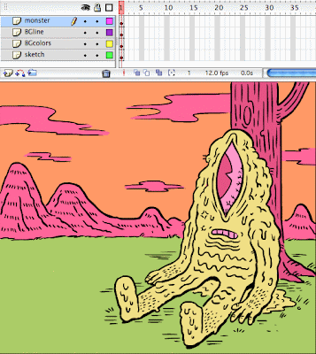
When I'm coloring a comic or a full illustration, it just makes sense to take advantage of multiple layers for background elements and details. Here's an example where I actually used both approaches. The monster is on his own layer (color and line), but the background line is separate with the background color on a layer underneath. The original sketch is still kicking around underneath that, too.
Just remember that painting on the same layer is definitely faster. When I paint on multiple layers, I'm usually regretting it half way through because it's almost always more time consuming.
Color AdjustmentBefore I wrap up, I want to mention the color-adjusting tools Flash has to offer. To make use of these options you have to convert what you want to adjust (be it the entire drawing, or just a color layer) into a Symbol. In versions before Flash 8, all you had to work with were Color Properties under the Properties window. Click on your Symbol, and select one of the following options:
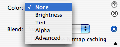 Brightness
 lets you either brighten (add white) or darken (and black) to your colors.
Tint does the same thing with a color, on a range from 0 to 100%.
Alpha allows you to make the entire symbol transparent (again, on a range from 0 to 100%). The clunkiest is the
Advanced option; click on Settings to launch a pop-up:
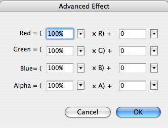
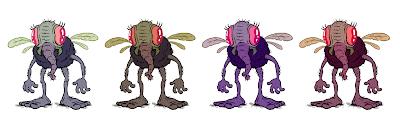
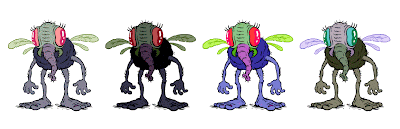
Look complicated enough? You can get fun results with this method by playing around with the various sliders, but it's very hard to predict until you get a feel for it. I still don't completely understand its logic, even though I use it make slight adjustments to my colors all the time.
In all current versions post Flash 8, you can apply
Filters to a MovieClip Symbol. One of which is called "Adjust Color." By selecting this option, you'll be in more familiar territory.
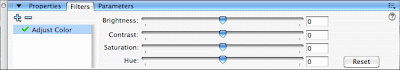
Simply adjust the sliders for Brightness, Contrast, Hue, and Saturation for useful/weird results.
The only problem with using Filters is that they don't export well out of Flash. You'll notice they even look blurry and crunchy in the program. If you export raster, the pixelation looks crude. Filters don't export to vector at all. Having grown accustomed to the Advanced color tool in earlier versions, I use it instead of the Adjust Color filter unless I know the end format will be a
.swf (Flash's native export format). Remember you can always do color manipulation outside of the program.
Exporting Final ArtFinally, a couple of you asked about this in my previous post: Flash sounds great, but how do I get my artwork out of it? I'll be as simple as possible with my recommendations. If you want to retain vector, I would export as
EPS. If you want to convert to raster, then the
PNG format works best. You can alter both (convert to CMYK or resize) in either Photoshop or Illustrator. The odds are you have those if you own Flash.
Phew, that was quite a post! As before, feel free to leave any comments or questions you have, and I'll try to answer them.
Read more in the FlashTips series:FlashTip #1: Drawing with a BrushFlashTips: Questions Anyone?FlashTip #3: Drawing Revisited


 Because Flash was designed for output to the Web, coloring is exclusive to RGB. You won't find CMYK around these parts. In fact, Flash is really tailored to web color. You'll notice this right off the bat when you go to select a color in the Tool palette (note there are options for both shape fill and stroke). There are 216 uniformly distributed hexadecimal colors to choose from. Now, we all know web colors aren't the prettiest palette to work with, which is why I'll point you directly to the color wheel icon in the upper right corner of the palette box. Selecting this will pop up various options for mixing color, which will be different depending on your OS. On a Mac, it will bring up the color wheel by default. I tend to gravitate to slider bars, so I opt for the second option. Here, you can choose between Grayscale, RGB, CMYK, and HSB—much like Photoshop. Remember that you're in an RGB color space no matter how you mix. Flash will always assign a hexadecimal code to your color. You can even enter a code if you have a specific color in mind. Another setting is your Alpha percentage. This lets you change the transparency of your color from 0 to 100%, allowing you to color in thin washes.
 You can also adjust color with the Color Mixer window. It gives you a bunch of options to play with, all in one space: RGB sliders, Alpha controls, the full spectrum of possible hues and saturations, a value slider, and a hexadecimal code. There's also a dropdown menu labeled "Type." It will be default to "Solid" for solid color, but it also has options for "Linear" and "Radial" gradients, as well as a "Bitmap" mode for fill patterns. Flash handles gradients well enough, but the controls are a little weird and take some getting used to (I'm not going to spend time on it in this post). You can use the Gradient Transform tool to rotate, stretch, and manipulate the boundaries of your gradient. Adobe added new functionality in CS3 that is similar to how Illustrator handles them, which is built into the Paint Bucket tool (just click and drag in a direction). My pal, Keith Zulawnik, is a master of working with gradients in Flash. You can view samples of his Flash illustrations here and elsewhere on his blog. I'm trying to convince him to do a little tutorial of his own. But I don't work with gradients much, so we're going to move on.
 Flash is set to "Paint Normal" by default. It does what you would expect; whenever you paint a new stroke, it will paint on top. Change your Brush color and you'll see what I mean. The two options I want you to pay attention to are "Paint Behind" and "Paint Selection." I rarely if ever use the others, but they are there if you want to experiment. "Paint Behind" is one of the best things Flash has to offer in the way of coloring fast and coloring loose. By using this setting, each time you paint it will always go to the bottom of the pile. So it's ideal for painting underneath your line. To use other option, "Paint Selection", simply select the area you want to color on (it will highlight fuzzy), and whatever you paint will only appear in that region.


 If you're already familiar with vector drawing apps like Illustrator, Flash features the ability to draw with both a uniform stroke (the Pencil tool) or a shape fill (the Brush tool). The Pencil has a uniform line weight which you assign a point-size to. The real magic lies within the pressure sensitive Brush tool. To unleash it, simply plug in a drawing tablet, click on the Brush icon in the tool palette and you'll see a black paint dab icon near the bottom that says "Use Pressure" on rollover (see blue arrow in side graphic).


 Flash also provides a very convenient way to go a step further with it's "Smooth" and "Straighten" tools which become available if the Selection Tool is selected. This will be a little harder to describe, but I'll try to show by example.


 The final iteration was a story where Ninja Turtle stuffed animals (like my own) came to life! Looking back, this was a way for me to make comics without having to labor over drawing all the complicated muscles and features.


